


Google Maps has changed a lot since its quick rise to ubiquity. An intrepid blogger digs into the nitty gritty of how the mapping platform has changed, and the consequences of Google's cartography for how the public perceives the world.

Justin O'Beirne examines the effects of several years of changes to the cartography of Google Maps—perhaps the most popular of the online mapping programs.
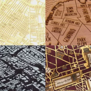
Browsing Google Maps over the past year or so, I've often thought that there are fewer labels than there used to be. Google's cartography was revamped three years ago – but surely this didn't include a reduction in labels? Rather, the sparser maps appear to be a recent development.
After digging into side-by-side comparisons of screengrabs taken from Google Maps in 2010 and 2016, O'Beirne notices obvious, and consequential, changes. For instance, Google Maps now has fewer city labels but more roads. In effect, explains O'Beirne, Google Maps has become a network map. "The cities are the nodes. And the roads are the paths between the nodes." [Emphasis in the original.]
O'Beirne concludes that both the 2010 and the 2016 versions of Google Maps suffer from a lack of balance between cities and roads. He does, however, offer an example of a map that achieves this balance more effectively, and even imagines what a Google map of Chicago would look like if it were balanced correctly.
FULL STORY: WHAT HAPPENED TO GOOGLE MAPS?


New Google Map Layer Shows COVID-19 Infection Rates
A new layer showing the seven-day average of confirmed COVID-19 cases started rolling out to Android and iPhones last week.

Google Maps Update Opens New Access to Mobility and Culture
Google Maps and other navigation and mapping apps have done a lot to inspire and educate people to make the most of their surroundings. New changes to the Google Maps app will add new functionality for those purposes.
Does the Evolution of Smartphones Come at the Expense of 'Spatial Thinking'?
Are smartphones supplementing the capacity of humans to think spatially, such that future generations might lose fundamental cognitive abilities?

Planetizen Federal Action Tracker
A weekly monitor of how Trump’s orders and actions are impacting planners and planning in America.

San Francisco's School District Spent $105M To Build Affordable Housing for Teachers — And That's Just the Beginning
SFUSD joins a growing list of school districts using their land holdings to address housing affordability challenges faced by their own employees.

Can We Please Give Communities the Design They Deserve?
Often an afterthought, graphic design impacts everything from how we navigate a city to how we feel about it. One designer argues: the people deserve better.

The EV “Charging Divide” Plaguing Rural America
With “the deck stacked” against rural areas, will the great electric American road trip ever be a reality?

Judge Halts Brooklyn Bike Lane Removal
Lawyers must prove the city was not acting “arbitrarily, capriciously, and illegally” in ordering the hasty removal.

Engineers Gave America's Roads an Almost Failing Grade — Why Aren't We Fixing Them?
With over a trillion dollars spent on roads that are still falling apart, advocates propose a new “fix it first” framework.
Urban Design for Planners 1: Software Tools
This six-course series explores essential urban design concepts using open source software and equips planners with the tools they need to participate fully in the urban design process.
Planning for Universal Design
Learn the tools for implementing Universal Design in planning regulations.
Borough of Carlisle
Smith Gee Studio
City of Camden Redevelopment Agency
City of Astoria
Transportation Research & Education Center (TREC) at Portland State University
City of Camden Redevelopment Agency
Municipality of Princeton (NJ)